
What’s YOUR (Presentation) Style?

One constant, across industries and company sizes, is the subjectivity of design. What looks “fresh and modern” to one client might be described as “dated” or “cluttered” by another.
Take this guy, for example, he probably thinks he looks youthful and great, but you might feel otherwise.
When design success boils down to subjective, personal taste, it can easily lead to endless revision loops, wasted mockup cycles, or even lost project opportunities, all before a build ever gets off the ground.
So, how can you — whether you’re a client hiring a designer or a designer setting up a project for success — ensure everyone is aligned on what looks good BEFORE investing hours into pixel-perfect creations?
It comes down to clear visual translation through mockups — and a free resource that I will be sharing with you in this post!
But first, WHY the discrepancy in visual design preferences?
Why Visual Preferences Differ So Widely

SNL “Mom Jeans” Skit Image
1 - Trends are Cyclical — and Generational
Old designs trends frequently circle back in refreshed forms. I remember thinking that the high waisted pants of the 80s and 90s (negatively referred to as “mom jeans” in the 2000s) would NEVER make a comeback. But, starting in the 2010s the high waist returned as a vintage trend fueled by younger generations (who were too young to appreciate the SNL parody of 2003).
Similarly, an editorial serif typography can feel cutting-edge to one generation while feeling unpolished or outdated to another.
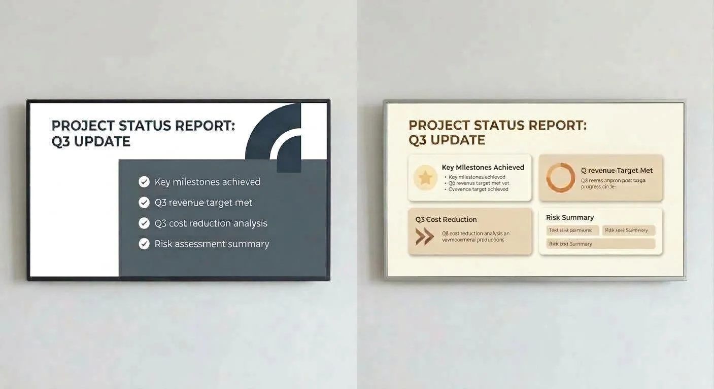
2 - “Design Speak” is Inherently Vague
Words like sleek, clean, bold, or professional mean completely different things to different people. A client asking for a “clean” look might picture stark minimalism with high-contrast slate tones (left side), while another pictures warm neutral spacing with soft drop shadows (right side).
3 - It’s Hard to Describe Visual Style Without Visual Context
Unless a client works in design daily, articulating exact aesthetic preferences — like layout density, color harmony, typography, or subtle glass effects — is nearly impossible using text or verbal feedback alone. (This is where the free resource I’m offering here will help!)
Bridging the Gap: The Value of Mockups, Mood Boards, & Style Benchmarks
When a project relies solely on trial-and-error mockups, initial designs can easily miss the mark simply because the vision wasn’t translated clearly at the start.
By establishing a visual baseline BEFORE drafting layouts, designers can:
Skip unnecessary revision rounds and establish aesthetic agreement before starting drafts.
Build immediate confidence by showing clients that their visual identity is understood right from the kickoff phase.
Eliminate miscommunication and give everyone a concrete, shared, visual vocabulary to point to in discussions.
Find Your Visual Baseline (With a Free Resource)
A web page featuring multiple visual examples followed by a description of each design style.
To solve this exact challenge, I put together a Visual Style Guide & Reference Library. This can serve as a starting point for new projects and visual explorations.
Whether you’re looking for dark-mode cinematic layouts, clean modern editorial styles, vibrant corporate systems, or rich textured palettes, this resource lets you browse concrete visual styles side-by-side.
Link: https://www.angelawatts.net/designstyles
How to Use This Resource
Browse & Bookmark: Pick (or ask the client to pick) the visual style(s) or layout approaches that immediately resonate with the brand or project goals.
Identify What Works: Note specific elements you love (or ask the client to note the elements they love) — whether it’s the contrast, color scheme, card styling, typography, or overall mood. Additionally, identify what you doesn’t work and any styles that you (or the client) would like to avoid.
Align Early: Use these reference points to set clear visual parameters.
By grounding design discussion in real visual examples from day one, we take the guesswork out of the creative process — saving time, protecting project timelines and budgets, and ensuring the final result feels exactly right.

Author: Angela Watts, M.Ed., SHRM-CP, CCTC
Angela Watts is an Instructional Designer, Visual Designer, award-winning Writer, and Forbes and WSJ-featured Careers expert. She specializes in developing solutions that improve the employee experience, the customer journey, and business performance.